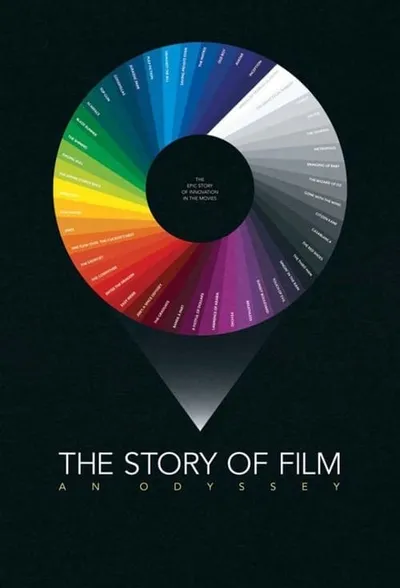

S1E12 The Silence of the Lambs - Who Wins the Scene?
In drama, two characters walk into a room. Each wants something from the other. The question of the scene is: who gets what they want?
Every Frame a Painting is dedicated to the analysis of film form.
Every episode at a glance, color-coded by rating. Rows are episode numbers within each season, columns are seasons.
The best and worst episodes at a glance. Use this to find must-watch episodes or ones you might want to skip.
In drama, two characters walk into a room. Each wants something from the other. The question of the scene is: who gets what they want?
Before Edgar Wright and Wes Anderson, before Chuck Jones and Jackie Chan, there was Buster Keaton, one of the founding fathers of visual comedy. And nearly 100 years after he first appeared onscreen, we’re still learning from him. Today, i’d like to talk about the artistry (and the thinking) behind his gags.
Four years after his passing, we still haven't quite caught up to Satoshi Kon, one of the great visionaries of modern film. In just four features and one TV series, he developed a unique style of editing that distorted and warped space and time. Join me in honoring the greatest Japanese animator not named Miyazaki.
One of the great things about detailed production design is that it pays off in unexpected ways. So today I explore the weird possibilities of that most common of objects: the chair.
Each point is an episode, plotted chronologically. The colored bands mark season boundaries. Look for upward or downward trends to see if quality improved or declined over time.
Vote count shows how many people cared enough to rate. High votes + high rating = beloved classic. High votes + low rating = notorious stinker. Low votes + high rating = hidden gem.
Episodes plotted by rating vs. vote count. The vertical line marks the rating threshold (7.5). More votes = more engagement. Toggle above to compare against global or show-specific median.
A simplified view: one point per season. This smooths out episode-to-episode noise to show the overall arc of the series.
Did each season build momentum or fizzle out? Green arrows mean the finale rated higher than the premiere. Red means the opposite. Longer arrows = bigger swings.
Some seasons are reliable bangers. Others are hit-or-miss. Each dot is an episode. Tightly clustered dots mean consistent quality. Scattered dots mean a mixed bag.
Each dot is an episode. Clustered dots = consistent quality. Scattered dots = variable season. Hover for episode details.